Creating a sense
or simplicity with
a new product family

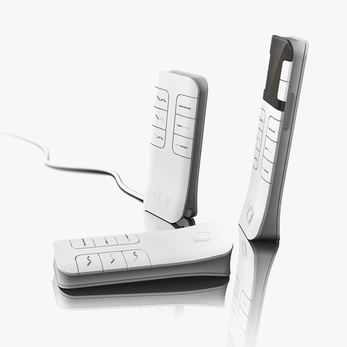
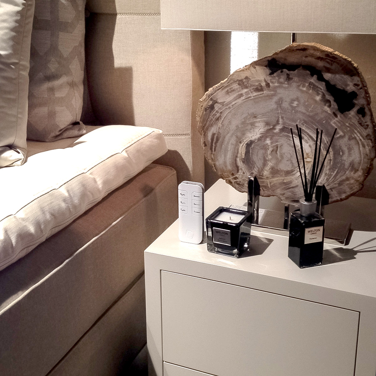
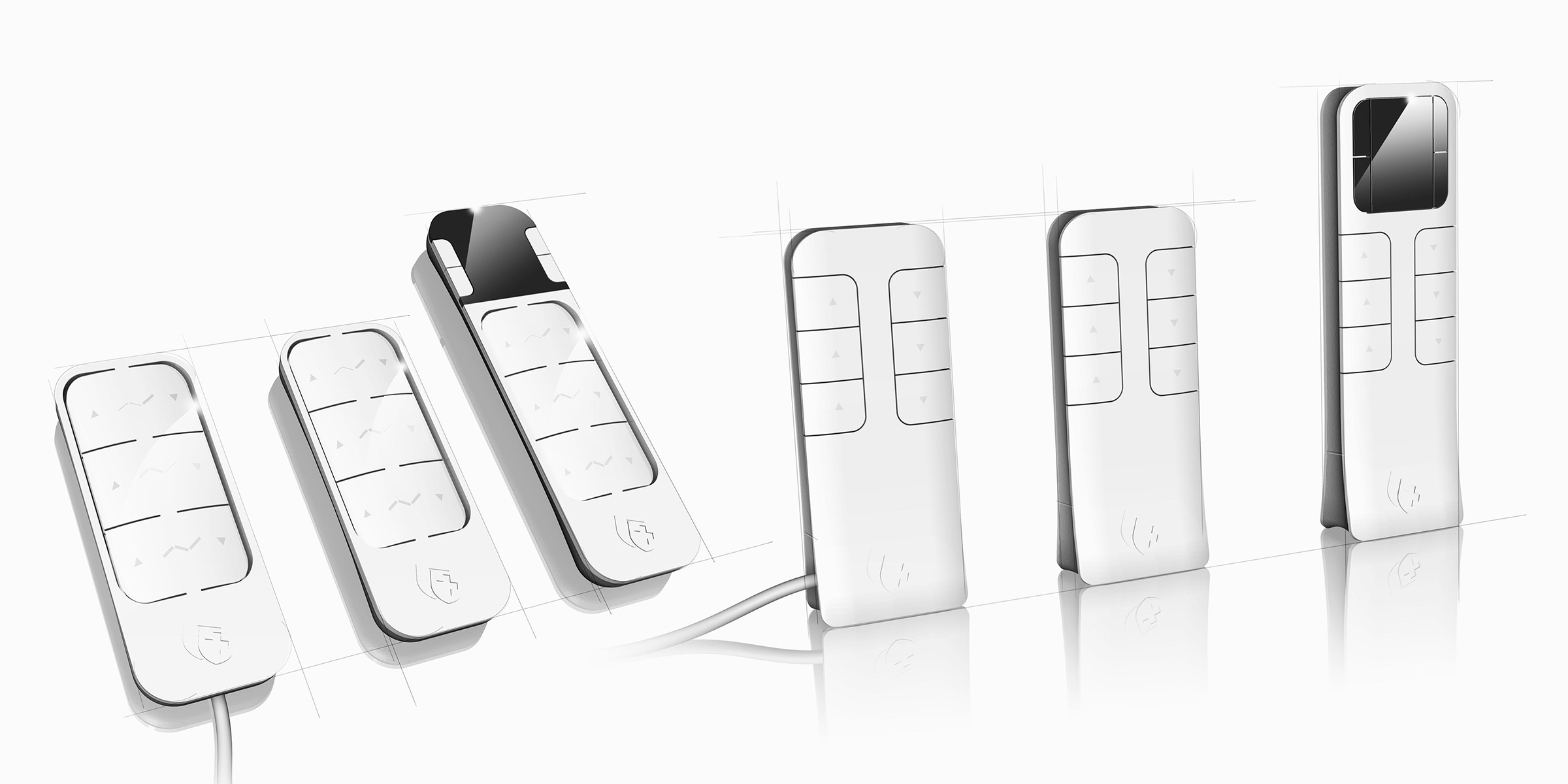
summary of the SWISS SENSE PRODUCT FAMILY

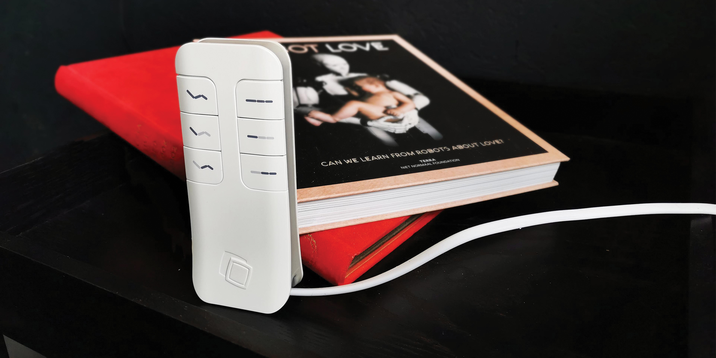
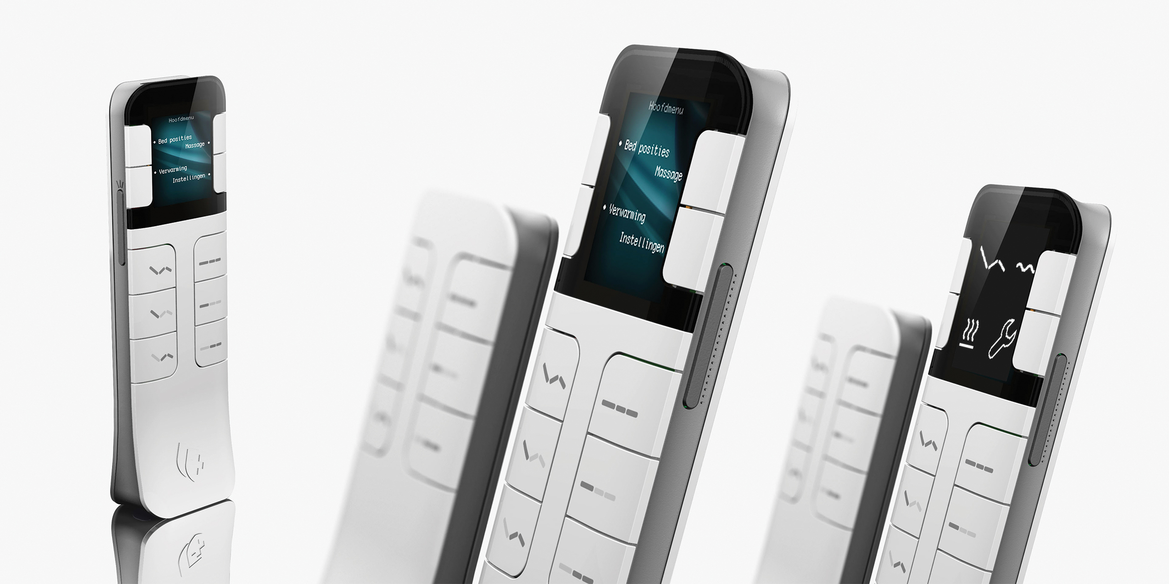
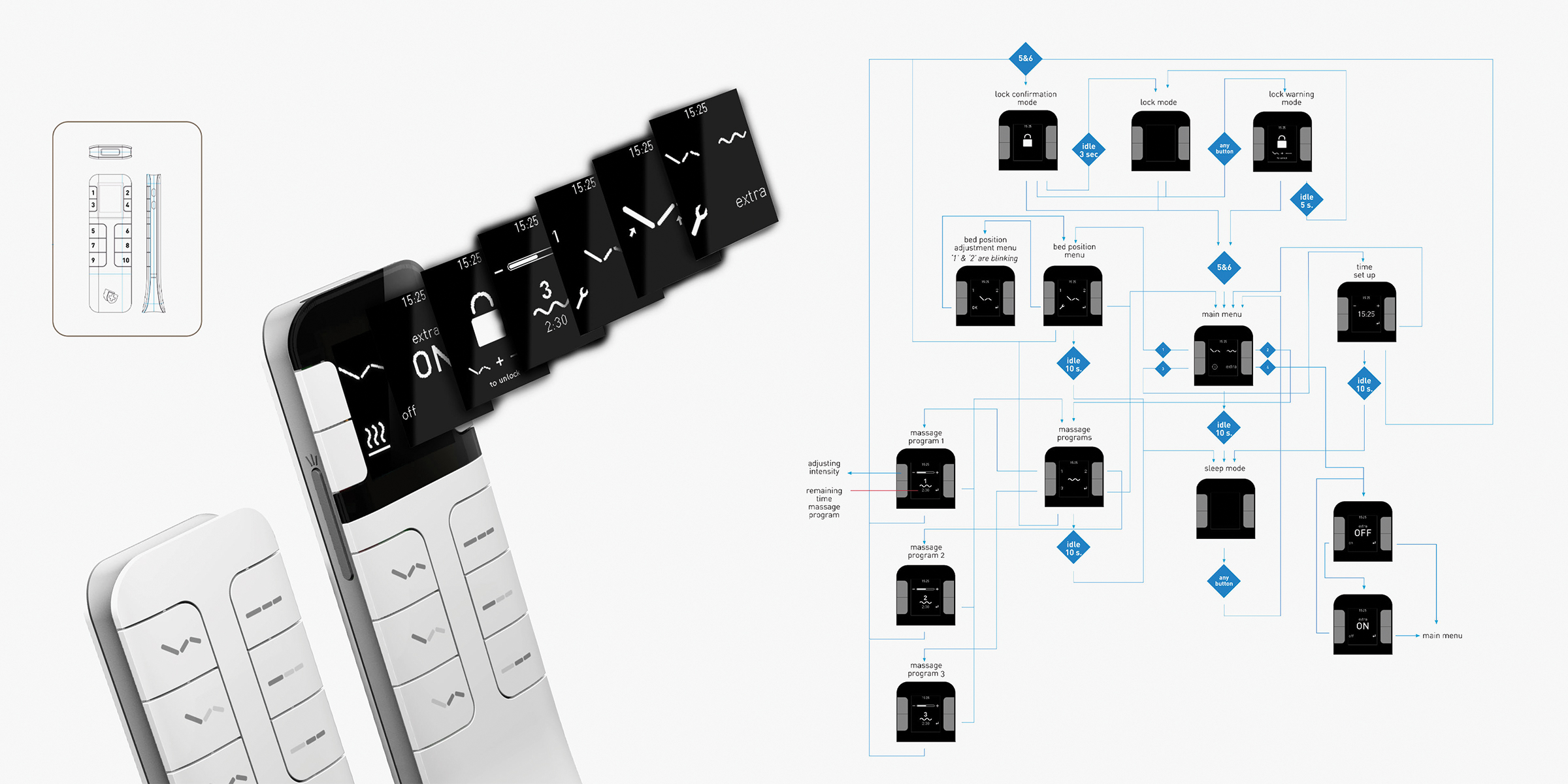
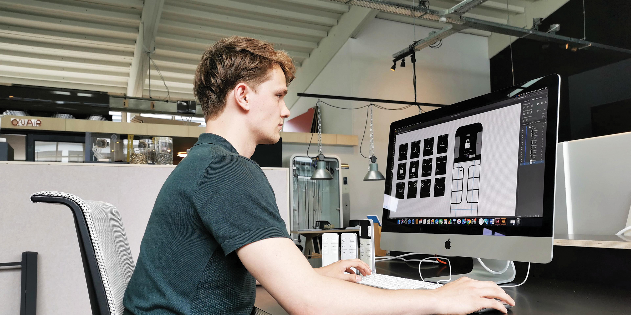
When developing these new handsets for Swiss Sense beds, Scope initially worked with Swiss Sense to clarify the desired brand identity. Using insights from the Visual Brand Language (VBL) research, it became clear that 'standing out in modesty ' had to become an important feature of the new handset. In addition to the hardware, Scope also developed the complete interaction of the user with the handset for the entire range of handsets, for example by choosing the display and software and developing a 'pixel perfect design'.

VBL TOOL

Scope started this project with an interactive process to find out what look Swiss Sense was looking for in the new handset. Using the on-line VBL tool , Swiss Sense's wishes were made concrete in an interactive way. This worked out well, as Eugène van den Bosch put it on behalf of the client ; Although it took some getting used to, Scope's way of working gave us insight into what we were actually looking for. We already had so many starting points for the handset in our heads, but were not aware of them. As a result, the sketches and the end product have really become our own.”

consistent brand experience

After applying the VBL tool, Scope went in search of a concrete translation into product features of “standing out in modesty” , an important feature for Swiss Sense for the new handset. By developing a handset that can stand proudly, like a statue and yet with graceful simplicity on the bedside table, this product got the desired look.

Scope developed a complete handset collection: with batteries and with a fixed charging cord. To be consistent brand experience To obtain beds from different product categories - luxury and less luxurious - we have designed virtually the same handsets for all beds.

Smart way of functionality and usability

This meant that for the variant with cord, consideration had to be given to attaching the cord to the handset. To ensure that this handset could also stand alone on the bedside table , the wire was cleverly integrated into the bottom of the handset.

GUI integrated and display selection

Scope Design integrated a Graphic User Interface (GUI) into the handsets for the beds from Swiss Sense. The choice of the type of display was decisive in this and formed the first challenge.

Initially, a color display was considered to meet consumer expectations. After all, smartphones have not been sold with black-and-white displays for years. By carefully analyzing the disadvantages of a color display (which will soon become unavailable and expensive), Scope chose to integrate a monochrome display into the design. The black and white display was custom made for Swiss Sense. In this way we achieved a maximum effect in terms of appearance and quality with minimal resources.

interaction design

After the component selection, we developed an extensive schematic overview for the complete interaction with the handset. In this way, the bridge was built between the desired options in the software and the hardware of the handsets developed by Scope. We then worked out the complete operation and functionality of the handsets and integrated the way in which bed and massage positions can be selected. Based on this, we were able to effectively consult with the software programmers about the software to be integrated into the handsets.

pixel perfect design

Scope was aware of the somewhat more limited possibilities of the textual representation in a monochrome display. That's why we paid a lot of attention to creating a 'pixel perfect design' . In this way we achieved the most optimal representation of text and images in the display with minimal resources.